Original Logos:
Letterhead:

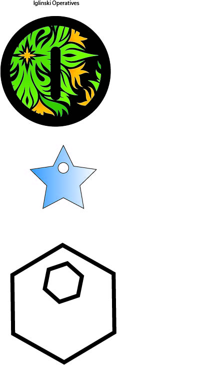
Business Card

Description and Process:
Hello and welcome to my 7A project! I had a lot of fun doing this for you. I decided to go with a complementary color scheme with the main color being my favorite-green. This was definitely one of the hardest projects for me because there wasn’t a whole lot to go off of, but I am definitely happy with the results. I started in Adobe Illustrator doing my logo and found a lot of really helpful shapes and colors that I could experiment with. I wanted to have the name of my company be Iglinski Operatives and have my design showcase a little bit about my nature. I experimented with quite a few designs, but I was only really happy with the first one that I came up with after drafts. I then ported the image to Indesign and began to construct my business cards and letter heads. After I decided on my final logo, I got the suggestion from Jeremiah to orient one of the sides of my business card as portrait. I think that that added a lot to the overall idea of the business cards in particular. I think that was able to generate a pretty good flow, with the most eye catching part being my last name. After completing my rough draft I realized that I had formatted my business cards wrong, and so I
Critique Report:
Jeremiah and I had a pretty good critique session, and we were able to talk a lot about the different ways that we could influence such a small space. I think that both of our projects definitely improved as a result of our critique. I also took your critique that Sister Godfrey gave me to heart and Message:
Overall I wanted my main message to be that I have a fun and laid back company that can also be professional, which is why I went with the complementary color scheme.
My main audience was myself since it is my company, as well as Sister Godfrey.
The main thing that I learned from this project was to not be afraid to scrap the whole thing and start over again. Luckily I had a lot of time to make everything again, but it was definitely better for me doing it all over again.
My color scheme was complementary and my colors were yellow and green.
My title font was a script font called Letra Hipster and my contrasting font was Euphemia UCAS, a sans serif font.
